반응형
https://getbootstrap.com/docs/5.1/content/images/
Images
Documentation and examples for opting images into responsive behavior (so they never become wider than their parent) and add lightweight styles to them—all via classes.
getbootstrap.com
.img-fluid
max-width: 100%;
height: auto;
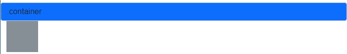
<div class="container-fluid form-control mt-3 bg-primary">.container</div>
<div class="container-fluid">
    <img class="img-fluid" src="./images/default.png" alt="...">
</div>
style="width: 100vh;height:30vh;" 수정 후 확인
<img class="img-fluid" src="./images/default.png" alt="..." style="width: 100vh;height:30vh;">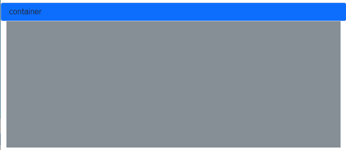
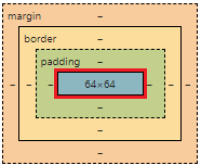
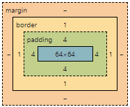
.img-thumbnail
- 1px 둥근 테두리도 렌더링
padding: 0.25rem;
background-color: #fff;
border: 1px solid #dee2e6;
border-radius: 0.25rem;
max-width: 100%;
height: auto;
<img class="img-thumbnail" src="./images/default.png" alt="...">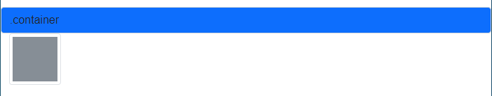
rounded
- 모서리를 둥글게
border-radius: 0.25rem!important;
<img class="rounded" src="./images/default.png" alt="...">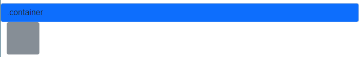
이미지 정렬
- text-start, text-center, text-end
- float-start, mx-auto d-block, float-end
- clearfix
- float 같은 경우 display: block(줄바꿈) 기능을 하지 못함
- 여기서는 float 속성을 해제하고 줄바꿈 기능이 가능하게 하기위해 사용
- mx(m: margin, x: x축 left & right)
- d(d: display)
.text-start
    text-align: left!important;

.text-center
	text-align: center!important;

.text-end
	text-align: right!important;

.float-start
	float: left!important;

.float-end
	float: right!important;

.mx-auto
	margin-right: auto!important;
	margin-left: auto!important;

.d-block
	display: block!important;
<div class="container-fluid">
    <div class="text-start">
        <img class="rounded" src="./images/default.png" alt="...">
    </div>
    <div class="text-center">
        <img class="rounded" src="./images/default.png" alt="...">
    </div>
    <div class="text-end">
        <img class="rounded" src="./images/default.png" alt="...">
    </div>
    <div>
        <img class="rounded float-start" src="./images/default.png" alt="...">
    </div>
    <div class="clearfix"></div>
    <div>
        <img class="rounded mx-auto d-block" src="./images/default.png" alt="...">
    </div>
    <div>
        <img class="rounded float-end" src="./images/default.png" alt="...">
    </div>
</div>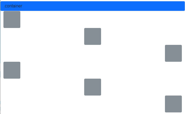
반응형
'부트스트랩' 카테고리의 다른 글
| [부트스트랩] Content - Tables (0) | 2022.03.13 |
|---|---|
| [부트스트랩] Content - Typography (0) | 2022.03.13 |
| [부트스트랩] Layout - Gutters (0) | 2022.03.13 |
| [부트스트랩] Layout - Columns (0) | 2022.03.12 |
| [부트스트랩] Layout - Grid (0) | 2022.03.12 |


